One of the most popular entries on WIPPP has been my 2015 Writing Workflow. My workflow has changed substantially over the last several years. I thought I'd share what I'm currently doing.
Read moreReading, extracting and storing scholarly information to supercharge the writing process
Bookends has completely replaced Papers.app as my citation manager. Despite this change, my method of information gathering has changed little since I covered the topic, except for one major addition. I am now finding the majority of information through qxMD Read.My workflow for extraction of annotations differs a bit from when I was using Papers. I now use the combination of Bookends and Highlights.app to extract each of my annotations and notes as separate files. In addition, after highlighting, I’ve been extracting the entire manuscripts in 1-4 paragraph pieces.The whole purpose of extracting annotations and full text from each manuscript is to gain granular access to the information I’ve read. Through its "see also" feature, Devonthink can identify information I’m looking for. But more importantly Devonthink finds related content based on the context of my original query.After importing a manuscript into Bookends, the document becomes available on all my devices. Bookends outshines Papers in its built-in annotation tools as well as its seamless syncing between iOS and Mac.
My current preference is reading PDFs on a 12.9" iPad Pro along with an Apple Pencil. In a pinch, I’ll annotate on my iPhone. On my first pass through an article, using Bookend's built-in tools, I highlight annotations and jot notes in green. I use blue to highlight quotes I wish to use verbatim. When I’m finished annotating, I add the keyword RFP (ready for processing) to the manuscript in the Bookend database.
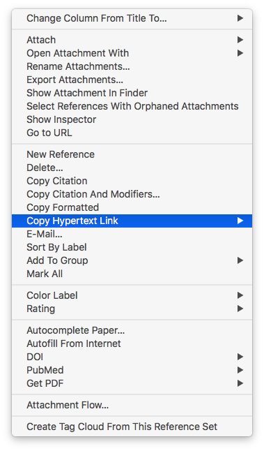
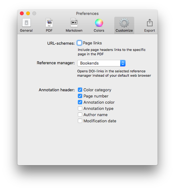
I have a Smart Folder set up in Bookends that finds the Keyword RFP. Uzsing this method, I can batch process multiple PDFs when I get to my Mac.When I'm ready to extract the information from the PDF into my Devonthink writing database, I export the PDF to my desktop and append the exported file’s name with FT (for fulltext).On my desktop, I open the file with Highlights. I use Copy Hypertext Link:Copy as Text from Bookends, and then open the “Edit” Tab in Highlights. Using use the text URL copied from Bookends to make a markdown link back to the Bookends Reference.When I export my annotations to Devonthink, the URL link will be appended to each file. Clicking the link within any extracted file takes me directly back to the reference in Bookends.I then turn my attention to Highlights.app. I make sure the annotations color preference is checked in Highlights.app. When checked, this preference will append the color of the highlight in each note.
Within Highlights, I use yellow to mark up the entire document over the top of my previous annotations. I highlight in 1-4 paragraph chunks. I also highlight the text of each table and figure.Once I'm done highlighting the entire paper, from within Highlights.app, I export my annotations to Devonthink from the Highlights.app menu. The annotations are saved as individual files to my Devonthink Inbox. I move the folder from the Devonthink Inbox to my desktop and then use Launchbar to move file from my desktop to my annotations folder. I put the desktop PDF in the trash, replace the RFP keyword in Bookends with DTx to remind me I've extracted the paper.
Since I’ve set up my Devonthink database to index this folder,the next time I launch Devonthink, the new information is catalogued and available for writing. The new information is also transferred to Devonthink ToGo to use while writing on my iPad.Using the Artificial Intelligence of Devonthink. I can quickly find related information. When I find an item in my database I want to include in my paper, clicking the link in the annotation takes me directly to the paper in Bookends.app.Using this method, I'm able to take full advantage of the Devonthink AI. Queries within Devonthink simultaneously find annotations, chunks of text and full manuscripts related to my search. I find this workflow invaluable when writing scholarly information.
***This workflow has been modified from here to the end-Please see Modification to Reading, Extracting And Storing Scholarly Information To Supercharge The Writing Process to see what I do instead.***
Keeping Current with Bookends and QxMD Read
In a previous entry, I covered the ways I add new literature to my scholarly manuscript collection. Technology has evolved since that entry. I’ve migrated to Bookends to keep my literature organized, and I have additional ways I find new literature I’d like to read. That’s what I’d like to cover today.In my MacWorld entry (circa 2012), I mentioned the three ways I collected new reading material:
as a recipient of an Endnote library (when writing collaboratively)
through personal searches on the web (and liberal use of Google’s automated search terms)
as attachments to colleague’s emails
Since then, there are two methods I use even more commonly:
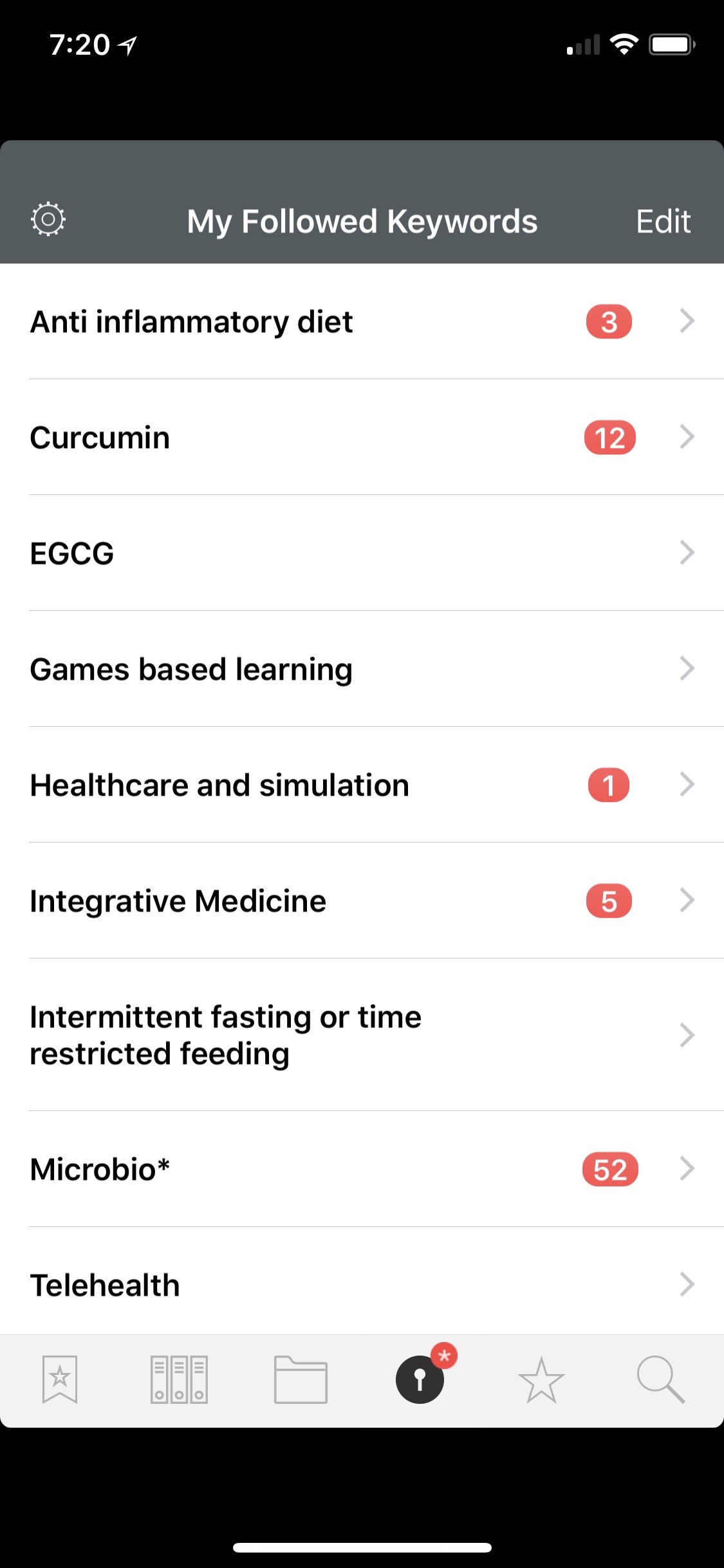
Until recently, I was not familiar with QxMD Read. A colleague at Duke, Dr. Jordan Komisarow, brought the app to my attention. According to QxMD, Read “provides a single place to keep up with new medical & scientific research, read outstanding topic reviews and search PubMed. This iPhone & iPad app provides a simple interface that drives discovery and seamless access to the medical literature by reformatting it into a personalized digital journal.” One comment describes the app as “The Flipboard of Medical Literature.”The app was easy to set up. First I made a QxMD username and password. Then I chose my professions of interest. Finally, I chose specific journals, keywords, and collated collections.Once set up, Read began scouring the medical literature for new articles.In a single screen, I scroll through all the new publications (titles, conclusion, journal, etc.).If I find something of interest, I click on the title to find more information, including the entire abstract. While I’m scanning the abstract, Read attempts to download the full-text PDF.About half the time, Read finds a PDF and downloads it into the app. If the PDF cannot be found, I email the entry to my personalized Omnifocus Mail Drop so the paper is added to my Omnifocus Inbox.If the PDF is downloaded into Read, it is then a simple task to move the document into Bookends. The ease of importing full entries is one of the many places Bookends outshines Papers. I click Open In… and then select the Bookends icon.Bookends works its magic, finding one (or sometimes more) suggestions as matches.I choose the matching metadata and Bookends imports the PDF and metadata into its database. The paper and its metadata are immediately available on all of my devices.The process works pretty seamlessly. The only annoyance is that if you save the PDF to your library, it receives a numerical name. You must later open Bookends on your Mac and rename the PDF to your naming convention. This is a small price to pay for such power.I'm finding even more relevant information these days using QxMD Read. My challenge now is finding the time to read and process it all!
My Migration from Papers to Bookends
I have dedicated a lot of time and energy squeaking every ounce of productivity from the Papers app. I’ve used Papers for more than a decade. Over the years, I built many scripts and work-arounds to address the shortcomings of the application.ReadCube purchased Papers in 2016. Because of the time I’ve spent in Papers, I started having angst when I read of certain changes to the software: a subscription model, the loss of Magic Citations, and the loss of integration with Scrivener.I started exploring alternatives to Papers. When I wrote about my interest in migrating away from Papers, several Wippp Readers suggested I check out Bookends. Several folks raved about the tight integration between Bookends and Devonthink as well as Bookends and Tinderbox—two other programs I use heavily in my academic life. Several people also mentioned the LEGENDARY support of SonnySoft, the company behind Bookends.My initial evaluation of Bookends was far too cursory. Following publication of the blog entry, I received a very nice email from SonnySoft asking me to take a closer look at Bookends. After digging deep into the software, I decided to migrate from Papers to Bookends. I haven’t looked back. It’s been several months now and the more I use Bookends, the more I like it.Things I like about Bookends:
The interface, although not as modern as Papers, is cleaner and more organized.
The iOS and Desktop version are better integrated than Papers.
A PDF on my phone is drop-dead easy to import into Bookends. The PDF and the metadata I choose is automatically synced with the Mac app (although I have to rename the pdf when I get to my Mac).
All PDFs are saved to a single folder in iCloud, making them easy to access and for Devonthink to index.
Bookends integrates well with Scrivener (and many other writing clients)
Dragging and dropping citations into Tinderbox and Devonthink are both seamless. Tinderbox maintains metadata from Bookends. This obviates the need for the KM script I built to move citations from Papers to Tinderbox.
Things I don’t like:
It was difficult to import Papers library with PDF into Bookends (Bookends only imported about 1/3 of my PDFs).
I can't export or customize the format of the exported metadata.
My smart collections don’t transfer to iOS.
Although I can designate a “watch” folder to import new PDFs into Bookends, this only works with PDFs that are saved to the folder AFTER Bookends is open. This didn't work well with how I collect information so I decided to modify my Hazel script, changing it to launch Bookends instead of Papers.
I don't like the way duplicate references and / or PDFs are handled.
Over the next few months, I plan to write several entries about my migration and how Bookends has become a critical part of my augmented writing workflow.
Capturing Information on my Apple Watch with Drafts and Day One
I’ve found new ways to utilize my Apple Watch as a capture device. I previously wrote about how I capture OmniFocus tasks with only my voice.I’m using this same method to capture other information in Drafts and Day One. Both have Apple Watch applications.Most of the time, I capture items to Drafts on my Watch. I capture ideas, clinical questions, quotes, etc. My watch synchronizes the new item with my phone (in the Drafts Inbox). When I have a few minutes I can vector the new memo to the correct location using Action URLs.
 Occasionally, I will capture items directy to Day One (although this requires the Day One also to be open on my phone). I maintain multiple journals: Personal, Professional, 3GoodThings, Social Media, and Accomplishments. I’ll capture to Day One if I also wish to capture the location the item took place. Most of the time, I just capture to Drafts.Although I was a bit skeptical about the utility of my Apple Watch at first, it has become a useful tool both in my personal and professional life.
Copied - a game-changing universal clipboard for all of your devices
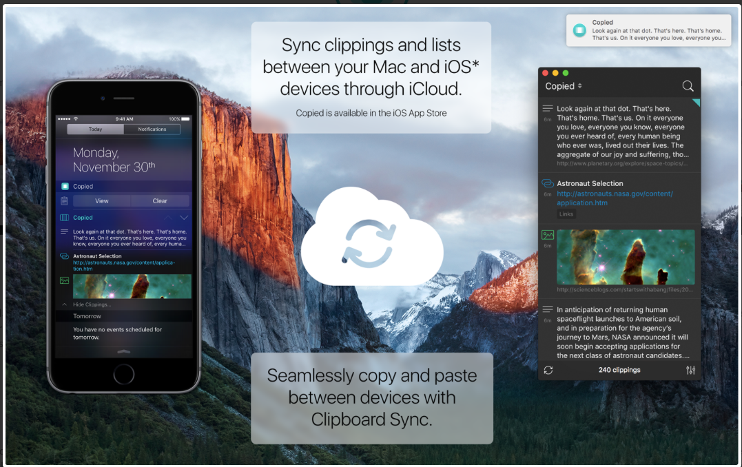
It is grant season and thus it's been quite some time since I've written an entry. Today I want to talk about the program I'm using quite extensively for writing and social media. The application is Copied. Copied is available both for Mac and iOS. Copied is a universal clipboard application that makes information available on all your devices (with an in-app upgrade). The ubiquitous availability of your clipboard, in my opinion, is priceless.
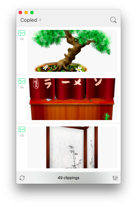 Some of the ways I am using Copied:
- Capturing screen shots of my iOS devices for blog entries.
- transferring information from programs such as Drafts to my Mac (without having to use an intermediary program such as Evernote)
- Capturing information on my computer and transferring to my phone (e.g. addresses, screenshots, etc.)
- Capturing images from the web—Copied automatically captures the URL of the picture and appends it to the clipboard entry (saving me the time it used to take to copy this information manually).
- Quickly capturing the titles of references I wish to download after finishing reading a manuscript in Skim.
- Capturing the references from a manuscript to be added to each of my extracted annotations.
I find a new way to use Copied every week. Copied has features (such as automated scripting templates) that I have yet to explore. Even without these unexplored features, Copied is a powerful addition to my writing toolbox - well worth the price.I’d be interested in hearing how others are utilizing this phenomenal app in their daily work.
OmniFocus + Focus - Pomodoro Productivity
Combining Omnifocus and the Pomodoro Technique is an incredible way to get things done. Years ago, I used a program called Eggsellent. Eggsellent integrated seamlessly with Omnifocus ( flagged tasks in OF were added to the Eggsellent queue). The upgrade from OF to OF2 broke the integration, and the Eggsellent developer did not update his app.In searching for a replacement, I tried Vitamin R2 and Tomatoes. I settled on Tomatoes for its simplicity and visually pleasing interface. Tomatoes did not meet my needs. The only way to get OF tasks into Tomatoes was to drag and drop (or type). This was a far cry from the workflow I enjoyed with Eggsellent.From Tim Stringer’s Learn Omnifocus website, I found a Pomodoro app called Focus. Focus is one step closer to what I’ve been looking for since the demise of Eggsellent. The Focus Interface is clean, intuitive, and attractive. Although Focus does not autopopulate flagged items from OF2, it is easy to add a task using the “Share” menu. Timers and tasks are synchronized on Mac, iOS, and Apple Watch via iCloud.Focus is still missing some of the functionality I desire in a Pomodoro app. Besides missing automatic OF2 integration, there is no ability to add tags to each item. The only way to add metadata is via a text box. Add that to the relatively steep price ($19.99 for the Mac version, $7.99 for iOS).Despite these shortcomings, Focus is my favorite modern Pomodoro app and has replaced Tomatoes as my timer of choice. Give it a try.
Capturing Reminders with Apple Watch Using only your Voice
I received an Apple Watch for the holidays. I had avoided the technology until I was compelled by the features and capabilities. This year, with the release of the 3rd generation of watch software, the device finally made my list.So far, I’ve been most intrigued by the ability of the Watch to capture reminders. I merely say “hey Siri, remind me to…” and my item is automatically captured. I’ve set up Omnifocus to grab my Apple Reminders. So now, with only my voice, I’m able to capture my to-dos on the run using only my voice. I'm sure to use this feature both in my personal and professional (especially clinical) lives.
Voice Dream-Listening to Scholarly Information (PDFs) on the Go
Keeping up with current medical literature is a constant struggle. The amount of information in healthcare doubles every 5-7 years. To keep up, I try to take advantage of time that would be lost (for instance, while driving in my car). I typically use my commute time (a 20 minute drive each way) to listen to audio books, but occasionally I’ll “read” a scholarly manuscript using a PDF-to-voice conversion program.My favorite app for converting PDFs to sound is Voice Dream. I initially found this app while looking for a way to listen to web content (before the feature was built into apps like Pocket and Instapaper). I was pleasantly surprised when I found Voice Dream could also translate PDFs.I prefer Voice Dream to other readers because of its customizability. I’ve customized the voice speed, pitch, and volume. The readback speed takes some trial and error in order to find the proper speed to keep your attention and allow understanding.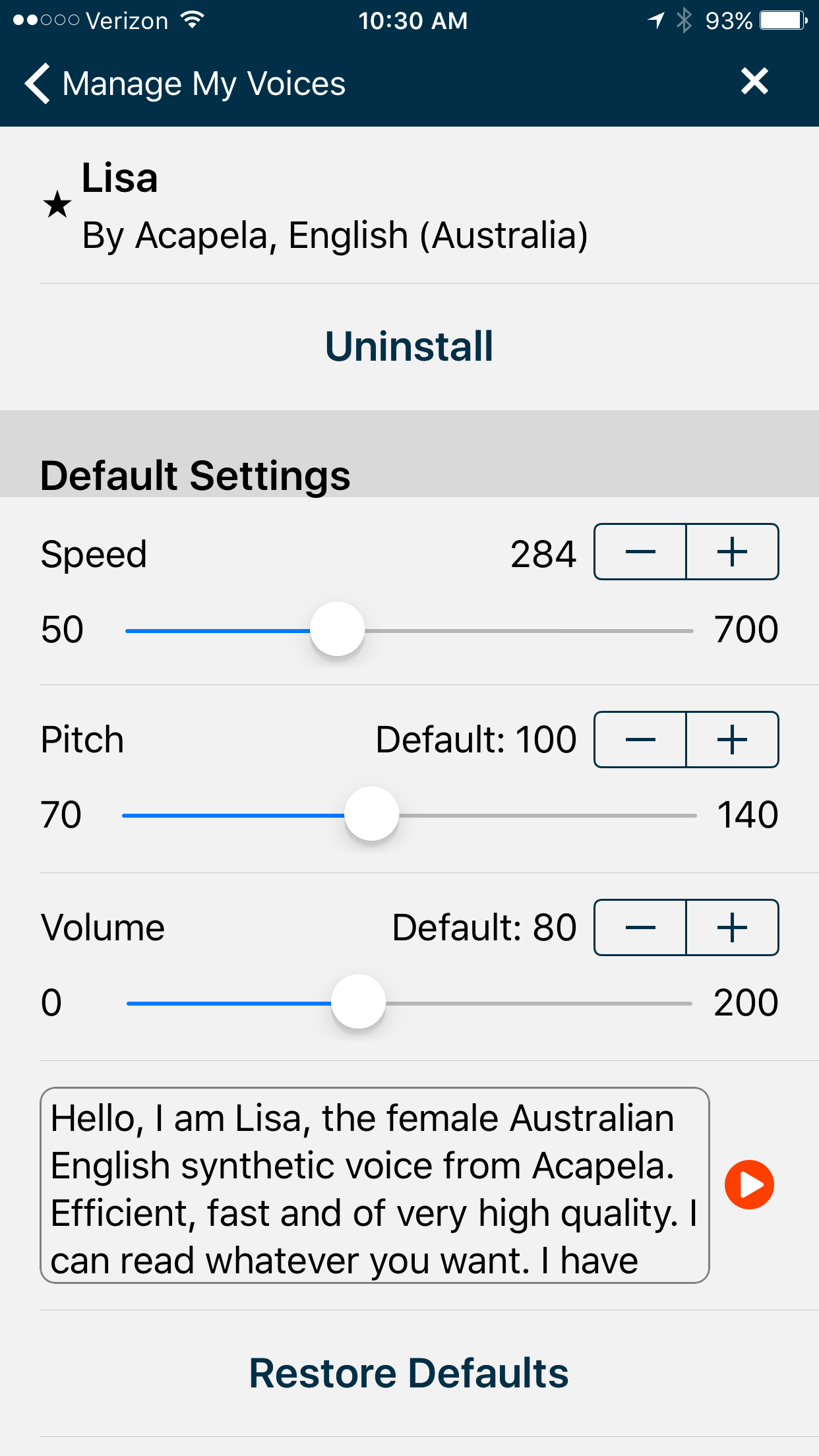 Voice Dream loads PDFs from Dropbox, Box, or Google Drive. I have a designated folder on Dropbox specifically for manuscripts I’d like to listen to. The interface for Voice Dream is intuitive. As the voice reads the text, the program highlights its current position in the text.
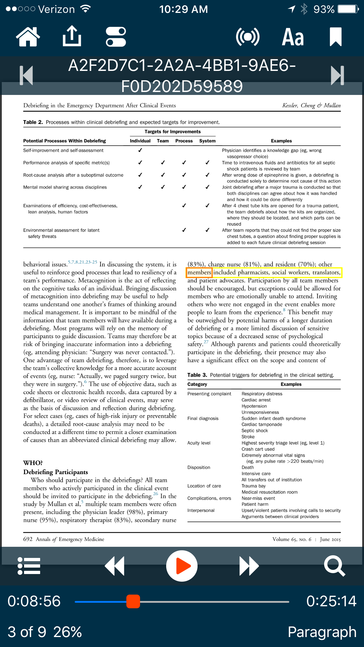 Using this method, I recover almost 40 minutes of time that would otherwise be lost. Let me know what you think.
Airmail 3 - A Unified email Experience to Rule Them All
Several months ago I wrote about my discovery of Spark email. I wrote about what I like and disliked in the app. Although Spark wasn’t perfect, I preferred it to the built-in iOS Mail app. I used Spark exclusively on iOS for a month.But then, a reader wrote and told me I should check out Airmail by Bloop. I had tried an earlier version of Airmail, but was less than impressed. Regardless, I decided to check out what had changed in the latest version.When I read the updated features of Airmail along with the promise of a simplified unified experience across all devices, I decided to give it a try. I’m glad I did—I’ve used Airmail exclusively as my email client since mid-July.From the Airmail website:
Airmail 3 is a new mail client designed for El Capitan with fast performance and intuitive interaction. Support for iCloud™, MS Exchange, Gmail™, Google™ Apps, IMAP, POP3, Yahoo!™, AOL™, Outlook.com™, Live.com™Airmail was designed from the ground to retain the same experience with a single or multiple accounts and provide a quick, modern and easy-to-use user experience. Airmail is clean and allows you to get to your emails without interruption - it’s the mail client for the 21st century.
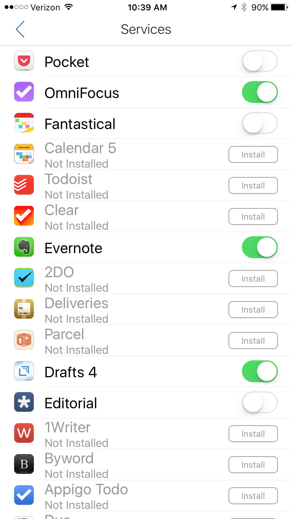
Beside the unified experience, I particularly appreciate the ability to customize every aspect of the email experience.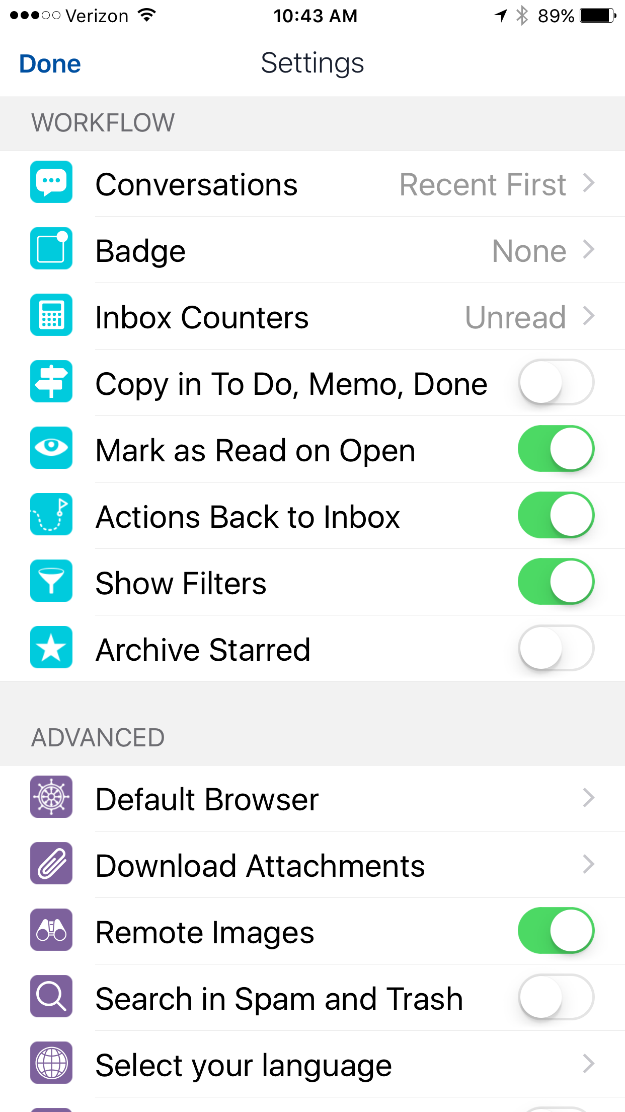 In addition, Airmail supports services (the actions I use most commonly include saving attachments to Evernote or moving an email to an Omnifocus task).
 There are 4 customizable swipes. I chose to customize this feature in the following manner:
- short left swipe-DELETE email
- long left swipe-bring up action menu
- short right swipe-Archive
- long right swipe-Snooze (message disappears to re-appear at a future time).
Another nice perk is the ability to synchronize accounts and settings using iCloud. This feature alone saved me tons of time when setting the app up on my Mac, iPhone, and iPad.I’ve been incredibly happy with Airmail over the past several months and don’t anticipate this changing. I hope you’ll give Airmail a try.
Launcher-An End to The Home Screen Real Estate Dilemma
Although I love the real estate of my iPhone 6 Plus, one of my ongoing dilemmas has been deciding what applications to keep on my home screen. I dealt with the dilemma by creating a series of folders. I never liked this solution since it looks cluttered and necessitates several clicks to get to any app.I recently rediscovered Launcher. Launcher gives one-click access to my most commonly used apps. Launcher works by installing widgets on the Notification Page of iOS (accessible by pulling down the menu from the top from any page). Launcher lets me launch apps, build communication shortcuts, access web pages, and much much more.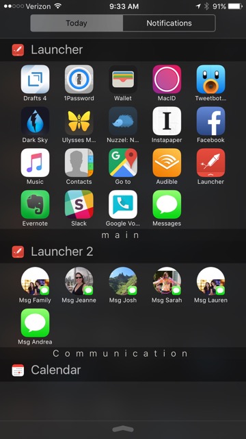 I’ve built widgets for my most commonly used apps, clinical apps and links, texting and calling my family, and travel. I can move these launchers in and out of my access bar depending on the situation. For instance when I'm traveling I move my travel widget higher on the Notifications Page.
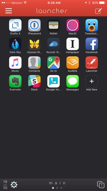
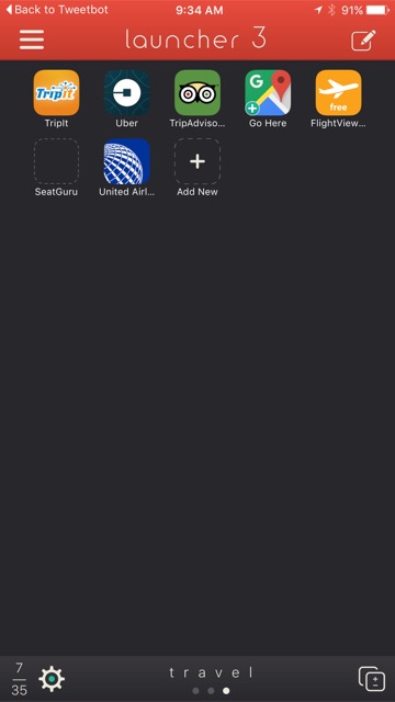 I found this application incredibly handy. It's changed the way I configure my home screen. Spending the $2.99 to unlock the Pro features is more than worth the price.
Capturing Clinical Questions Using Drafts and Evernote
Being a physician means a commitment to lifelong learning. In a busy clinical practice, two-thirds of clinical encounters generate at least one clinical question. In an average day the typical physician has at least 11 unanswered clinical questions. Only 40% of those questions ever get answered. Most of the questions are forgotten in the hustle and bustle of clinical care.In an attempt to improve my ability to capture (and answer) these questions, I've developed a new script for Drafts. This script uses the same concept as the technique I've mentioned to capture ideas, quotes, etc. This particular script saves information to Evernote but you could use Ulysses, DayOne, Wunderlist, or any other app you can program with an action. I chose Evernote since Evernote has the ability to find related notes anywhere in my collection. When researcing answers my question I capture those to Evernote as well-linking the question and answers in my Evernote database in perpetuity. Since Evernote is ubiquitous, the answer is available on my computer iPhone, and iPad.Here is how I approached this. First, I set up a new notebook in Evernote. I called this notebook "Clinical Questions." I then developed the following script in Drafts. Using this script it is now possible for me to quickly capture questions investigate later. I merely open Drafts and type or dictate my question, then hit the script. The question is logged to my Clinical Questions Notebook (along with date and prepended with tag ClinicalQuestionX).I’ve found myself using this script many times each day. I hope it helps you as well.Stats found on UptoDate: http://goo.gl/BDBqmH
Ulysses Now Publishes Directly to Wordpress
Ulysses just keeps getting better. With the latest Ulysses release, you can publish directly to Wordpress (either wordpress.com or your own custom Wordpress site).
Scrivener iOS coming on July 20!
I have been quite impressed with the Scriver iOS Beta--it's capabilities far exceeded my expectations both on my iPhone and iPad. It has already simplified my Writing Workflow. I'm not alone in my exuberance. Check out this glowing review. The wait for The official release is almost over....the official date Is July 20 at a price of $19.99. There will be a simultaneous release of a new version of Scrivener for Mac.
Drafts Script to Capture Ideas to Ulysses
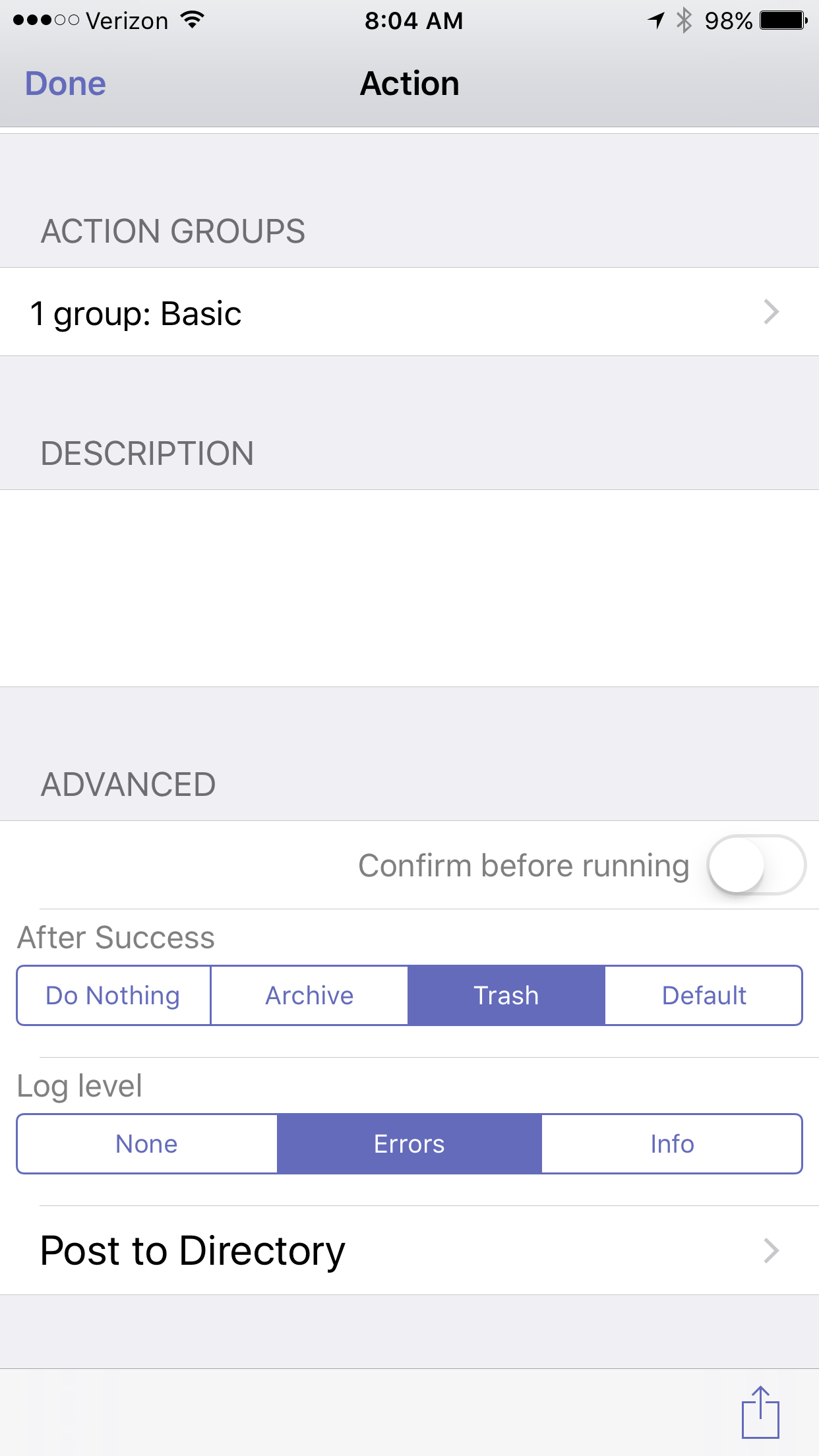
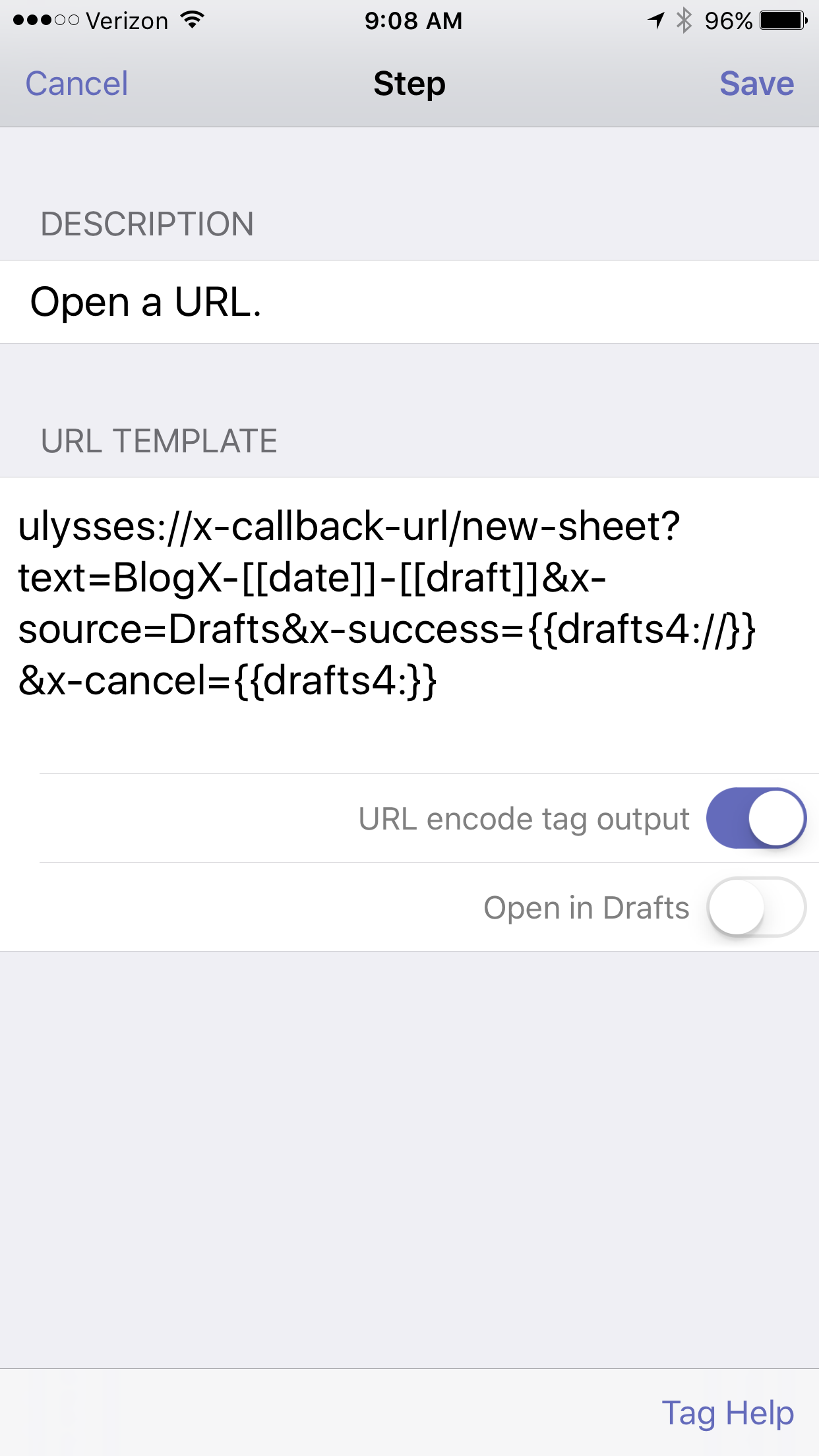
As I've mentioned in previous writing, I am a big fan of Ulysses. I now do all of my short writing in Ulysses, so I decided to transition my blog idea script from Drafts->Evernote to Drafts->Ulysses.The script prepends "BlogX" and the current date, erases the Drafts file, then places my new idea in my Ulysses Inbox.In Ulysses, I keep three blog related groups: Ideas, In Process, and Published. I no longer have to take time to move my ideas from Evernote to Ulysses. Instead, each idea is submitted to Ulysses, eliminating entirely the need for Evernote. If you use lUlysses, you can adopt this script for capturing other ideas as well. I hope you find it useful.
Free Time 2 - scheduling made easy!
Meetings are unavoidable in academics. For busy professionals, finding a time to meet can be a daunting task. Although apps like Outlook have built in scheduling features, few use them. One major limitation; Outlook's scheduling features only work for individuals using the same corporate domain.Previously, I wrote about my love of Sunrise Meet--a fabulous add on to Sunrise that smoothed the task of scheduling meetings. Sunrise was purchased by Microsoft and, unfortunately, the app will soon be shuttered. Thus, I went on a quest to find a Sunrise Meet replacement. I'm happy to report I found great alternative: Free Time 2Free Time 2 is a standalone app for iOS. The interface is clean and intuitive. If I receive a meeting request, I merely open the app and surf to the potential day(s) of interest. Each day displays a list of appointments along with my free time. I select as many potential meeting times on as many days as I’d like to propose.
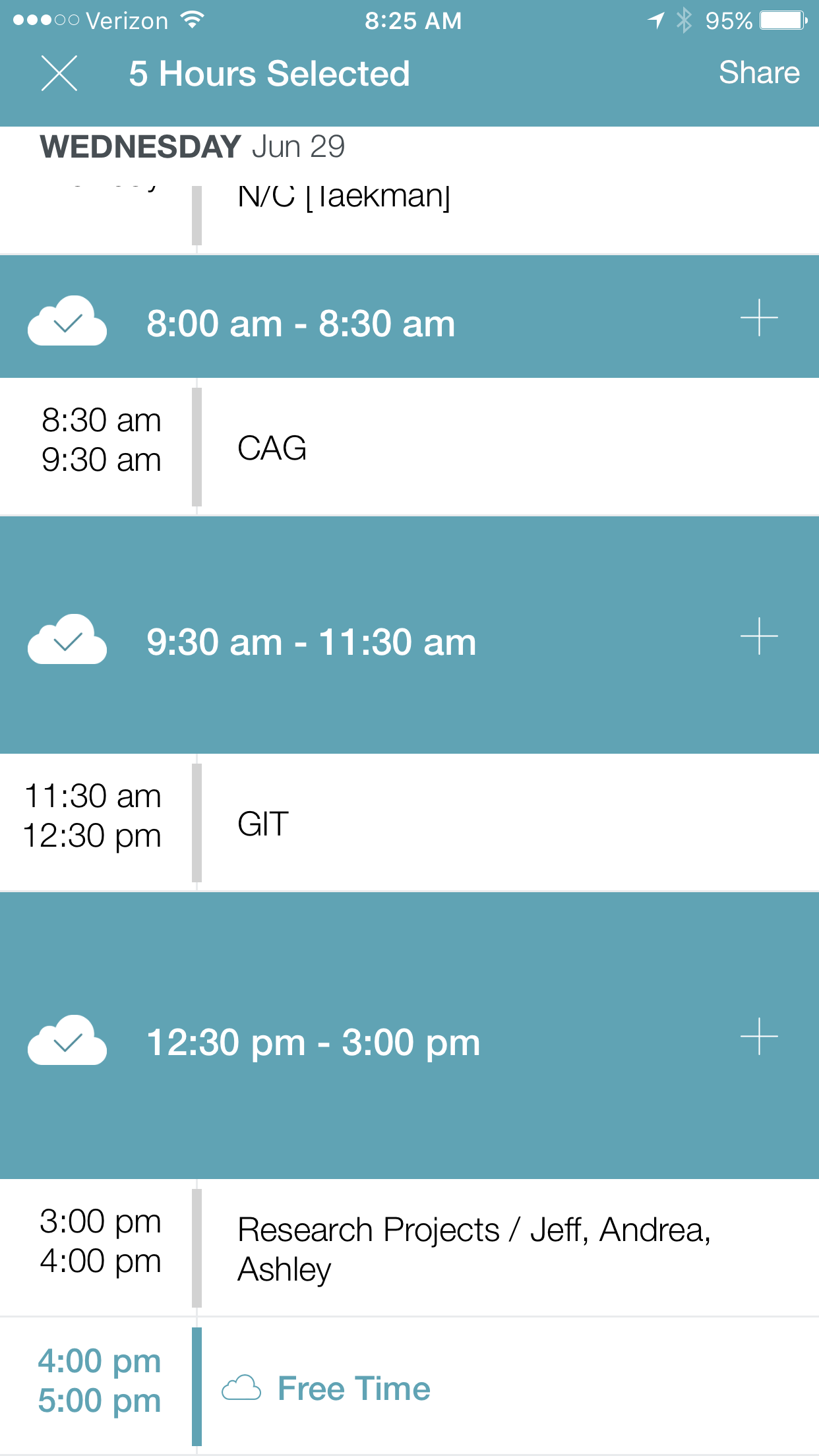 I then hit “Share,” opening the Action Menu.
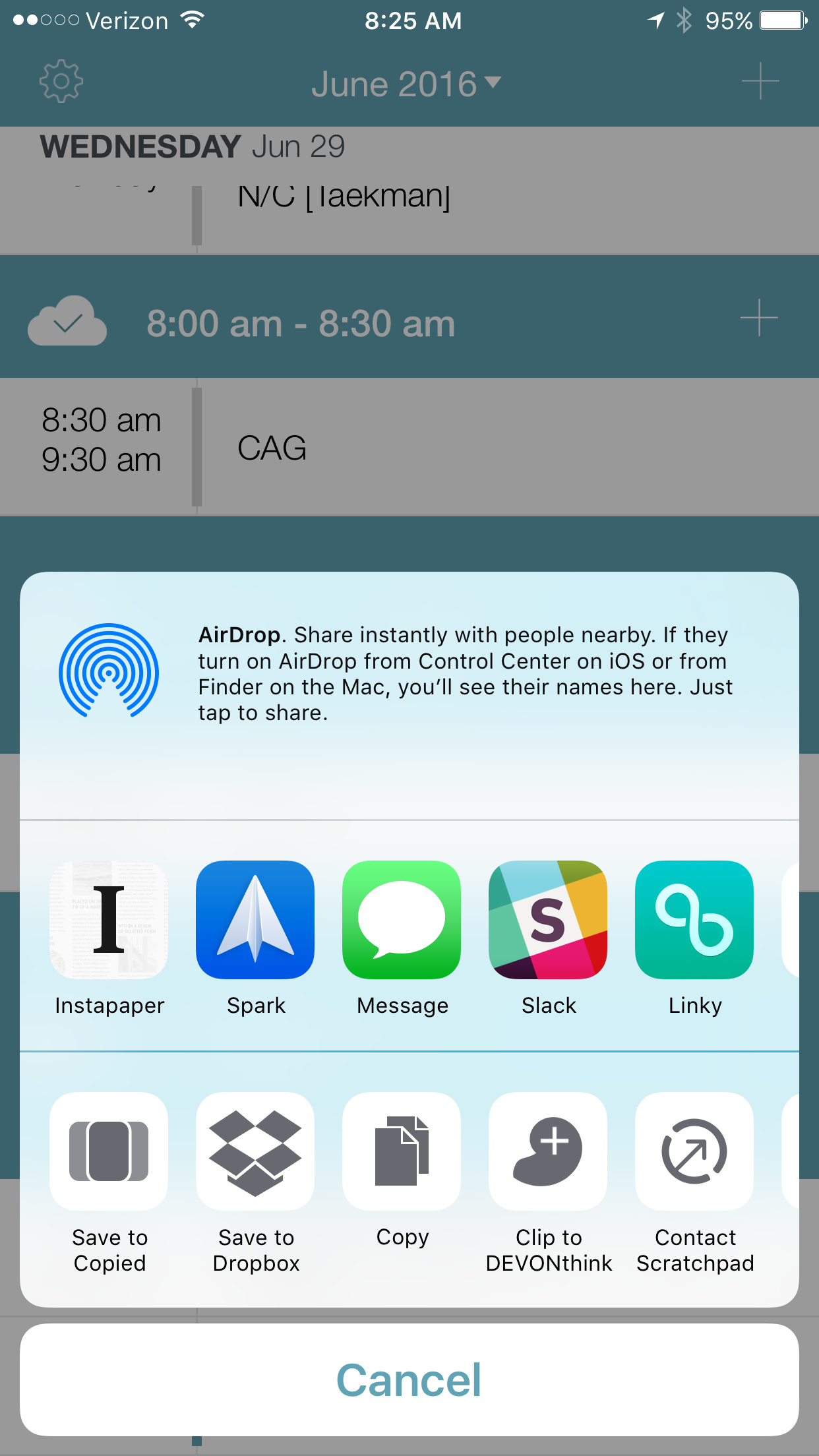 I choose what app I’d like to share my availability. Free Time formats the list of the potential dates for me. Here is an example in Spark.
 Free Time 2, in many ways, outshines Sunrise Meet. I use Free Time several times each day to schedule 1:1 meetings. Now if only there was an app that could seemlessly handle multi-person scheduling. Enjoy!
Spark by Readdle - my new email app
eMail is the bane of everyone's existence. Although I’ve been pretty diligent about reading email on the go, a problem I frequently faced was the issue of “skimmed emails”-those emails I read on the go but failed to immediately process. Later, when I returned to my Mac, I often missed the skimmed email because each appeared "read." Unfortunately, until recently, I had not found a suitable solution to this recurrent problem.I am a big fan of Macsparky. One of my favorite features on David Spark’s Web Site is the sharing of user’s home screens. In a recent post, I saw Brett Kelly (Website)(Twitter) mention Spark by Readdle and decided to give it a try. I have to say I’ve been incredibly impressed. Spark has completely replaced Mail.app on my phone and iPad. I can’t imagine going back.Spark is one of those apps that is a delight to use. The developers paid a great deal of attention to user-interface design. Even now, several weeks into my exploration, I continue to find subtle features that really do live up to Readdle's promise to have me “Like Your email Again."Spark has almost completely eliminated the Skimming problem on my phone. I now process 98% of my emails as I read them on the go. My Inbox has remained essentially empty since I started using the App.A few minor suggestions that could make the program even better: 1. the ability to add actions to swipes (ala Drafts) and 2. the addition of other gestures (taps?) that would further enhance the number of customizable processing options.Spark is now my iOS email client of choice. I hope you give it a try too.
Google GBoard - Love it!
I have become a big fan of the new Google keyboard, Gboard. I've been using this keyboard for IOS over the last week. During that time, Gboard has become my keyboard of choice supplanting the native Apple keyboard. I particularly like the ability to glide type and the ability to look up information on Google without leaving the current application. I’ve found emoji links, GIFs, and image links less useful.The only three drawbacks I have found include:1.losing the ability to dictate, 2. losing the ability to enter passwords, and 3. the fact that GBoard does not understand Apple Keyboard Shortcuts.For more information check out the Cult ot Mac article. Download Gboard and give it a try. I think you'll be pleasantly surprised.
Lifehacker Review of Ulysses.app
Thorin Klosowski wrote a great review of Ulysses App on Lifehacker. Check it out.
The Sun Sets on Sunrise.app--iOS Calendars
One of the most-used application on my iPhone is my calendar. For quite some time, Sunrise has been my go-to app. About a year ago, Sunrise was purchased by Microsoft. This week, Microsoft has decided to kill the app. With the announcement that Sunrise will be inactivated in August, I started a search for an iOS calendar replacement. Although Sunrise appears to now be baked into Outlook for iOS, my workplace doesn’t allow me to use the app to access my Outlook account. I’m going to sorely miss Sunrise’s integration with LinkedIn and especially, the Sunrise Meet feature, that I use frequently.I am trying two calendars as replacements: Cal by Any.do and Fantastical 2. Neither seems perfect, but I’m leaning toward Cal for its clean design. I’ve never been fond of Fantastical’s user interface and I’m always a sucker for good design.I’ll keep you posted on what I find. If you have a particular go-to calendar app, I’d love to hear what you use, and why you like it.


